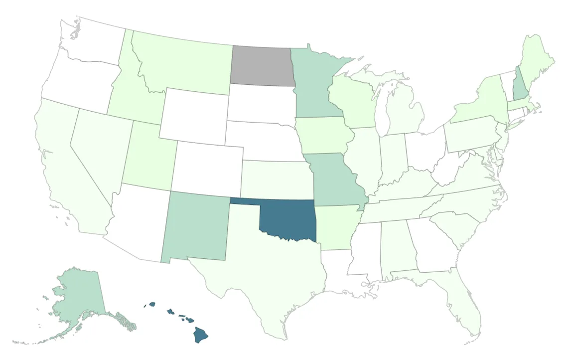
Reported COVID-19 New Hospital Admissions Rate
US Centers for Disease Control
This page shows CDC data on COVID with a one- to two-week delay (scroll down to see the map). For example, when the map is updated on April 14, it shows the data for April 1 - 7.
The default setting tells you whether the number of people who have gone to the hospital with COVID in the last week is high, moderate, or low. If you hover over the map with your mouse, you can see data for each county. (Note: Hospitalizations don't start to go up until a surge has been going on for about two weeks.)
If you change the settings, you can see rates for deaths, people who went to the emergency room with COVID, or test positivity.
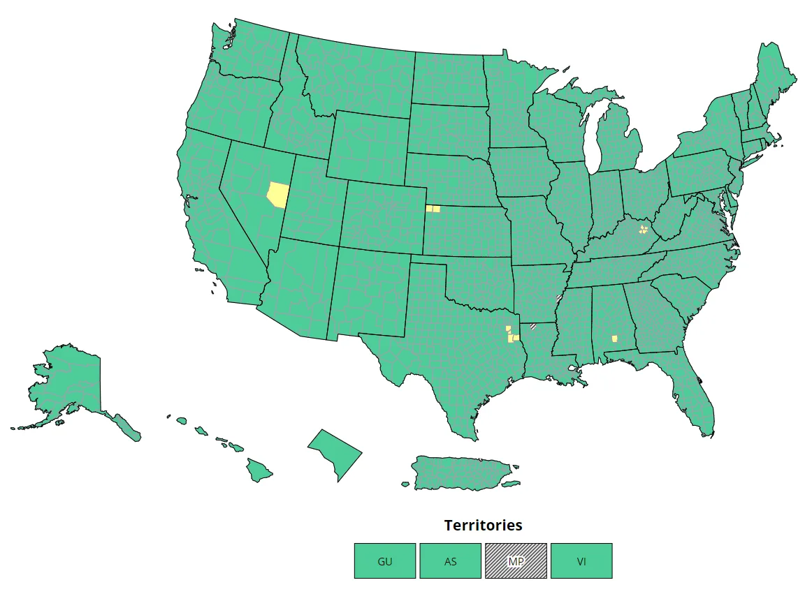
COVID-19 Current Wastewater Viral Activity Map
US Centers for Disease Control
This page shows CDC data on COVID-19 in wastewater with a five- to 12-day delay. For example, when the map is updated on April 14, it shows the data for the week ending April 9.
Scroll down to see a map showing the COVID-19 level in wastewater in each state.
Note: When a surge happens, virus levels in wastewater go up first - before case counts or hospitalizations.
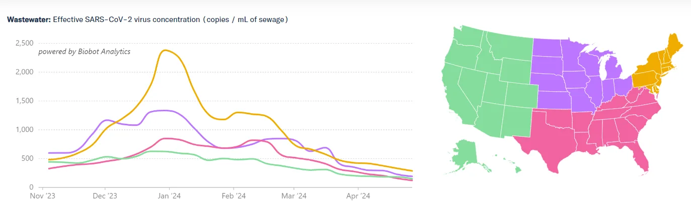
COVID-19 Wastewater Monitoring by Region
Biobot Analytics
Biobot Analytics is a company that tests wastewater from sewers across the country.
On this page, they show a line graph that tracks virus levels in wastewater over time (you have to scroll down to see the graph). The four lines in the graph each represent a different region of the US.
State and Local COVID-19 Wastewater Dashboards
The COVID-19 Data Dispatch
Roughly half of US states have their own dashboards that track COVID wastewater data. A few local and regional public health offices do, too.
Once you get to the site, scroll down a bit to find the list of links.

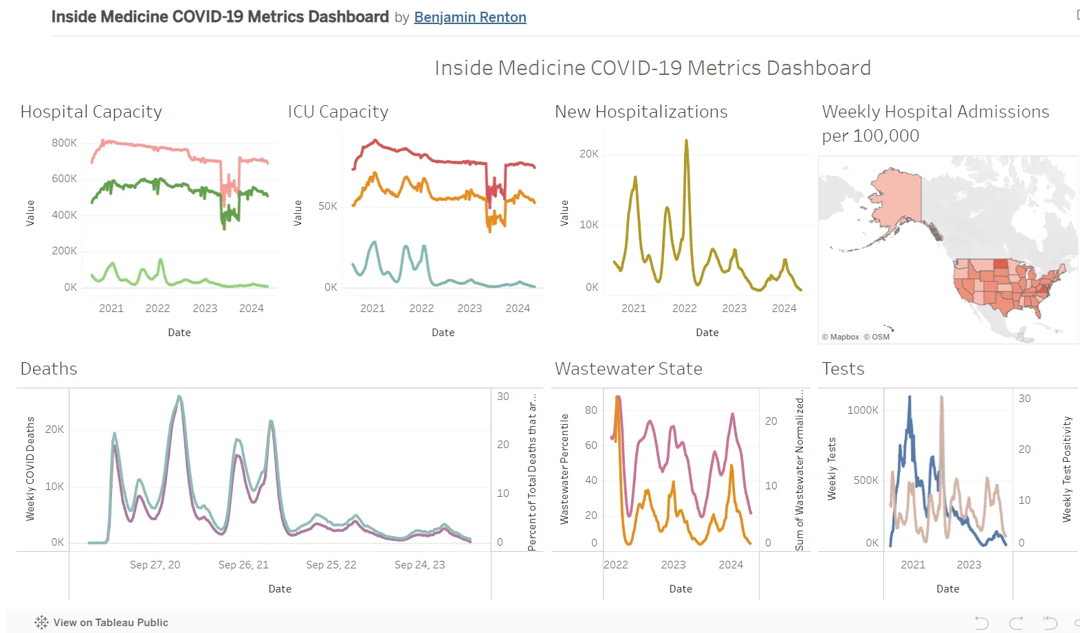
Inside Medicine COVID-19 Metrics Dashboard
Benjamin Renton, Brown University School of Public Health
Line graphs showing levels of all things COVID:
Number of people in the hospital
Number of people in the ICU
Number of people sent to the hospital
Deaths
Wastewater levels
Testing levels
When you get to the page, it shows you the data for the entire United States. Using the menu, you can see data by state or by county.
All the data comes from the CDC and the US Department of Health and Human Services.
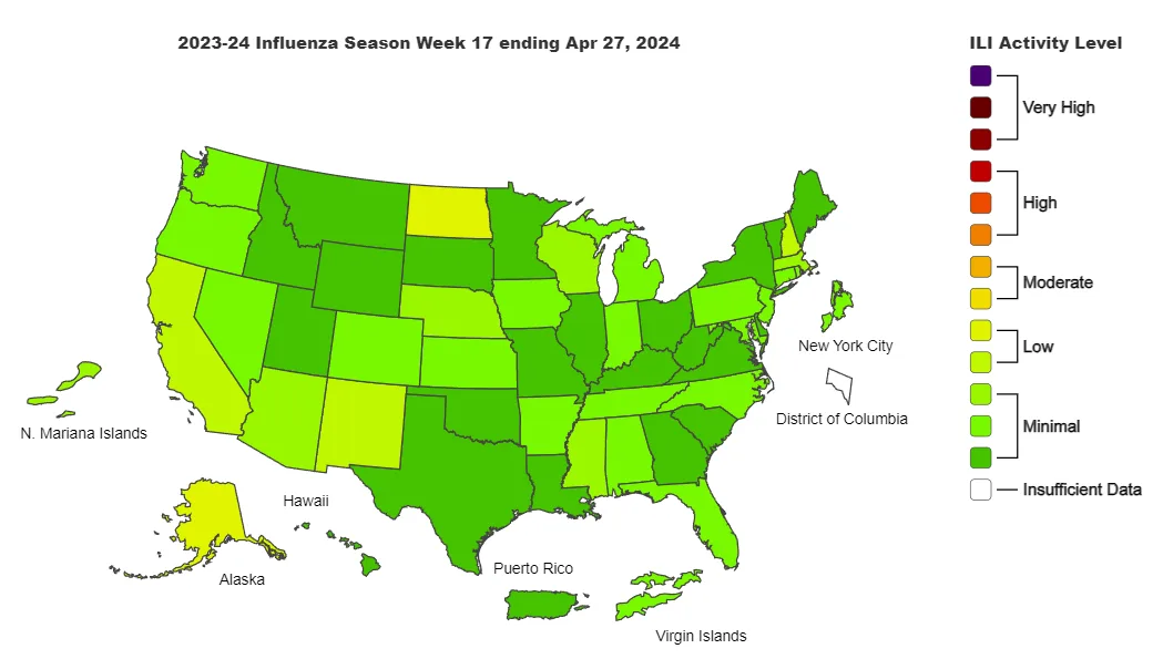
FluView
US Centers for Disease Control
The map on this page is based on how many people see their health care providers because they have a fever plus a cough and/or a sore throat. That group of symptoms is called "influenza-like illness," or ILI.
The colors on the map tell you how much influenza-like illness has been reported in each state with a one- to two-week delay. For example, when the map is updated on April 14, it shows the data for April 1 - 7.
Note: The levels shown on the map are based on symptoms only, not on test results.
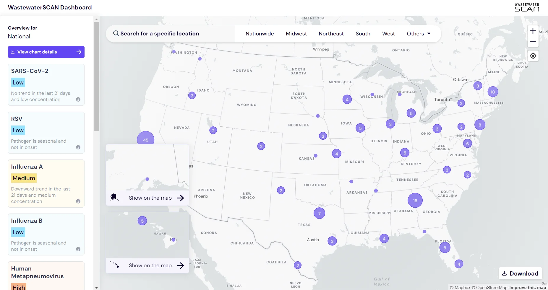
The WastewaterSCAN Dashboard
WastewaterSCAN
On this page, you can look at wastewater data for lots of different viruses, including COVID-19, flu, respiratory syncytial virus (RSV), and more.